4 April 2019
Massimo Vignelli, one of the greatest graphic designers of the 20th century, has been a “hero of the two worlds” whose biography makes almost frightening reading: nothing but stellar successes in his professional career, which has now been recounted in the delightful volume Design: Vignelli 1954-2014 (Rizzoli International), an updated version of a book called just Design: Vignelli published in 1990, edited on this occasion by Beatriz Cifuentes-Caballero but laid out by Vignelli himself before he died. The words added at the bottom of the cover are “Graphics, Packaging, Architecture, Interiors, Furniture, Products.” Already the fact that Vignelli had literally designed his complete works and even his funeral shows just how much he was heir to the model of “total designer” put forward by Walter Gropius and the Bauhaus, whose centenary falls this year. And it was precisely as a fanatic that Vignelli defined himself when he took part at the age of just 18 in the 7th CIAM held in Bergamo in 1949: the one on the synthesis of the arts (where a small exhibition was staged in tribute to Giuseppe Terragni) which must have been quite a sight for someone like him who was beginning to open his eyes and had just enrolled at Milan Polytechnic. He would later move to the IUAV in Venice, where he made up the students’ journal, worked for the famous Venini factory of artistic glassware and turned his attention to some of the more neglected aspects of university life, such as the signage in the lecture halls. In the lagoon city he met a student from Friuli, Lella Valle, sister of the architects and designers Gino1 and Nani2, who would become his wife and professional partner, even though, as in the case of the couple Venturi & Scott Brown, Lella’s decisive role would not be universally recognized for many years: their partnership had always been a matter of “holding a pencil with four hands.”3 Their first collaborations were with Milanese architects, and certainly not unknown ones: Giulio Minoletti, specialized in industrial design, and Giancarlo De Carlo, still young but already in the orbit of the CIAM. From then one it would be a Rossinian crescendo in the years of the “industrial style.”4 Thanks in part to a study grant obtained by Lella, the couple made a first visit to New York immediately after their marriage in 1957 and then, when their residence permit expired, returned to Milan, where their first child, Luca, was born.
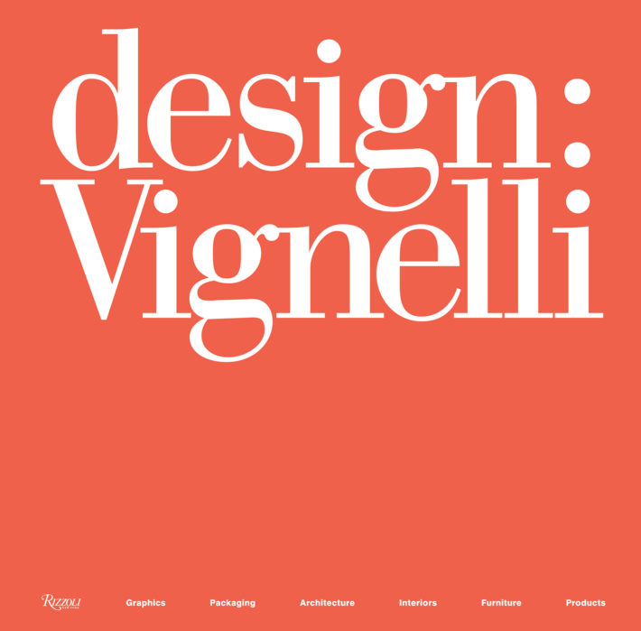
Cover, Design: Vignelli 1954-2014, edited by Beatriz Cifuentes-Caballero. © 2018 Rizzoli International Publications, New York, and Beatriz Cifuentes-Caballero.
In the meantime, the country was changing too and Vignelli, as he would declare in one of the considerable number of documentaries that have been made about him, was increasingly impatient with the provincialism that held sway in Italy, then as now. His ideal was a neo-Futurist one, that of a graphical reconstruction of the universe,5 and Milan, notwithstanding the wealth of commissions and extremely stimulating exchanges of ideas with colleagues, was starting to feel cramped: in Milan “the ceiling was too low. I came to New York thinking that the ceiling would be higher here, only to discover that here the ceiling doesn’t exist at all!” At the time Vignelli’s universal ambitions needed a helping hand, a shoulder to lean on in addition to Lella’s: he found it in Bob Noorda, the Dutch graphic designer of the Milan Metro (1963) with whom he returned to IUAV as a teacher of industrial design (even though he had never graduated), and their common path took them to Florence for publishing reasons. In fact, as Mario Piazza has pointed out, in the sixties every major publishing house adopted a new graphic design that would go down in history: “Without neglecting the lesson of Steiner for Feltrinelli, already successfully formulated since the fifties, we see Bruno Munari at work with Einaudi, Mimmo Castellano with Laterza, Anita Klinz with Il Saggiatore, Massimo Vignelli with Sansoni and the Schwarz editions, Giulio Confalonieri and Ilio Negri with the Lerici editions. Noorda played a part too, with a very limpid and original project. The project for Edizioni Vallecchi.”6 In this triangle formed by Milan, Venice and Florence (where Sansoni and Vallecchi were based), Noorda and Vignelli collaborated more and more often, creating a de facto professional partnership that was consolidated with the historic Feltrinelli SC/10 series of 1964, the one with the large F at an angle of 45 degrees, and then culminated formally in the creation of Unimark Int in 1965:7 this was the leap in scale which he had been looking for, the one that would take Vignelli back to New York in the decisive year of 1966, this time for good. The other partners in Unimark were Ralph Eckerstrom, Jay Doblin, James Fogelman, Wally Gutches and Larry Klein. Within a few years Unimark had opened a dozen branches, including one in Australia, for it was not so much a style that characterized the firm, as a way of working: “If it’s a style it’s not design. Design is a professional solution to a specific problem,” Vignelli liked to say, and that was how he won over all the big American corporations, overhauling their visual images, or corporate identities: Bloomingdale’s, American Airlines, Knoll, Heller, Ford, IBM, The New Yorker, etc. The success was so marked that those responsible got cold feet and drew back from their creation: Noorda because he was homesick for Milan, Vignelli out of disagreements with the other partners and over the ever more tediously commercial approach.
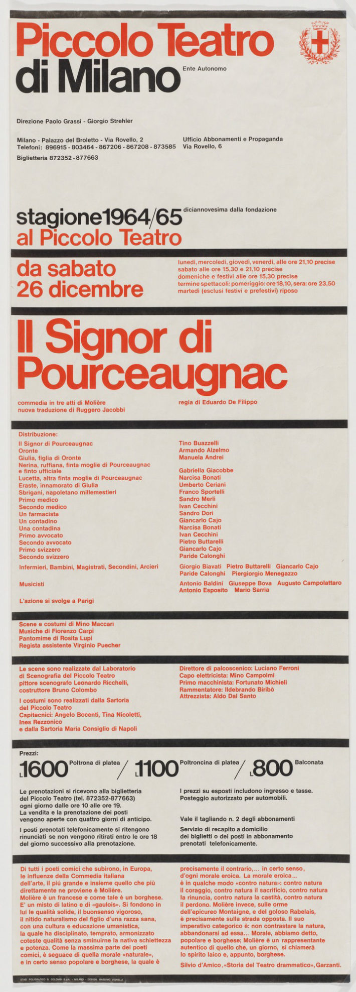
Massimo Vignelli, Piccolo Teatro di Milano, 1964. © The Museum of Modern Art / Licensed by SCALA / Art Resource, NY.
But by now the fat was in the fire: the “Swissification” of the USA had commenced, thanks to the massive use of a single family of typefaces, the Helvetica,8 which Vignelli handled skillfully right from his first masterpiece, the 1964 poster for Giorgio Strehler and Paolo Grassi’s Piccolo Teatro, with its thick black lines and omnipresent, invisible grid, an example of classical clarity that he would propose again for the signage of the New York subway and its legendary map with the routes optimized at 45-degree angles—amended by the authority in a more conventional manner in 1979 because it disoriented users. In the Big Apple it was above all the publishing world that Vignelli won over with his graphic design. For example, in the posters, booklets and brochures for events at the Institute of Architecture and Urban Studies (1967-84) directed by Peter Eisenman.9 At that time the IAUS was assuming a pivotal role for international and in particular Italian architectural culture:10 Eisenman invited Aldo Rossi, Manfredo Tafuri and their students in Venice (Giorgio Ciucci, Francesco Dal Co, Massimo Scolari, Georges Teyssot) to the US and the magazine Oppositions with its orange cover for which Vignelli did the graphic design pro bono and to which Rafael Moneo, Bernard Tschumi and Rem Koolhaas contributed, became its banner.11 Among all the architects, however, the one with whom he would develop the most productive partnership was Richard Meier, i.e. the one who had the greatest professional success in the eighties and nineties. The relationship, facilitated by the fact that they had their studios in the same building in Manhattan, resulted in a series of publications in a square format with a simple title,12 where only the colors changed. A pinnacle of “unreconstructed modernism,” as Kenneth Frampton (formerly on the editorial staff of Oppositions) described the inclination of the Milanese graphic designer,13 but it was more of a manneristic modernism, in line with that of the members of the IAUS, so intolerant of the functionalist character imparted to American universities by Gropius. Neither Vignelli nor Meier’s work has the brutality of early modernism. What they sought instead was a cultured and classically refined formalism. It is no coincidence that in Vignelli’s few architectural designs there is a constant reference to Palladio, the Mannerist from the Veneto at the root of the veneration of the color white that characterizes the whole of British Palladianism as well as Meier’s architecture. The overlap between the two could not have been greater: Joseph Rykwert has told Mario Piazza that he once came across a Canadian publication on Meier that was probably the only one not made up by Vignelli. It took the cultivated British historian a long time, browsing through it, to realize that the works were Meier’s and not somebody else’s. The effect was disconcerting.
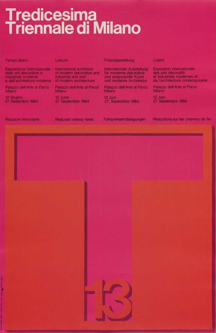
Massimo Vignelli, Tredicesima Triennale di Milano, 1964. © The Museum of Modern Art / Licensed by SCALA / Art Resource, NY.
In any case, the last few decades have also been years of intense work for the Vignelli studio, in Italy as well, where it has been responsible for the corporate image of Lancia (1978) and Cinzano (1984), the reappraisal of the image of major brands like Benetton (1995) and Ducati (1997), the labels of Feudi di San Gregorio wines (2001), the logo of the Fondazione Renzo Piano (2011) and even works for public corporations like the logo and studios of Tg2 Rai (1989)—where one of the Frau armchairs also designed by the Vignelli studio, the red Intervista of 1988, can still be found—or the signage for the Italian rail network (1999). The Vignelli canon14 has been applied in almost every direction, using a very small number of typefaces, Helvetica obviously, along with a revised Bodoni and a Roman for more minute and descriptive texts, somewhat outmoded today. In the documentary Helvetica, Massimo Vignelli makes a brief appearance, declaring that typography in reality does not deal with black and white, but only with white—that Palladian white again—because the typeface is already codified and what really counts is the gap between the letters, a bit like in music where it is the interval between the notes that determines a melody: “From this vantage point, visual communication, whether by means of art, craft, or industrial production, is the outcome of a logical process based on a credo of purity and essentiality—on the emptiness that is absolute fullness.”15

Nava calendar, 1976, Design: Vignelli 1954-2014, © 2018 Rizzoli International Publications, New York, and Beatriz Cifuentes-Caballero. Photo: Elizabeth Torgeson-Lamark (RIT).

American Airlines, corporate identity, 1967. Design: Vignelli 1954-2014, © 2018 Mondadori Electa, Milan, and Beatriz Cifuentes-Caballero.
Bloomingdale’s, graphic and packaging program, New York, 1972. Design: Vignelli 1954-2014, © 2018 Mondadori Electa, Milan, and Beatriz Cifuentes-Caballero.
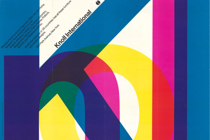
Poster for Knoll International, USA, 1967, Design: Vignelli 1954-2014, © 2018 Rizzoli International Publications, New York, and Beatriz Cifuentes-Caballero. Photo: Elizabeth Torgeson-Lamark (RIT).

New York Subway map, 1970, Design: Vignelli 1954-2014, © 2018 Rizzoli International Publications, New York, and Beatriz Cifuentes-Caballero. Photo: Reven T.C. Wurman.
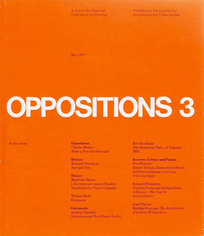
Massimo Vignelli, Lella Vignelli, Oppositions 3, 1974, © The Museum of Modern Art / Licensed by SCALA / Art Resource, NY.
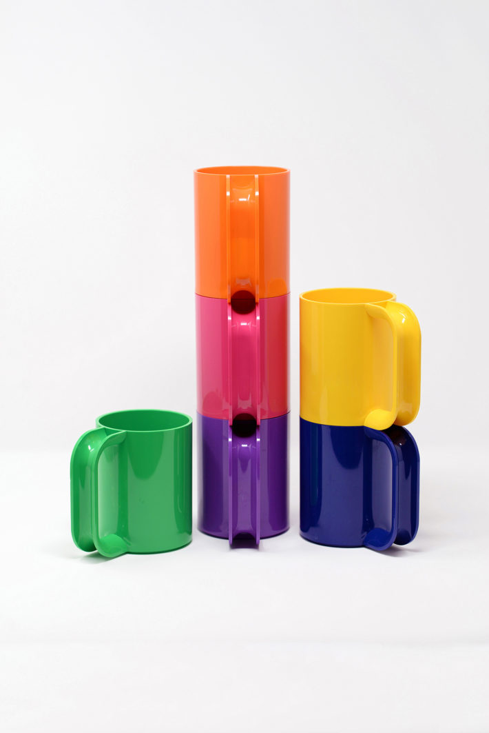
Heller stacking cups, 1970–1972. Design: Vignelli 1954-2014, © 2018 Mondadori Electa, Milan, and Beatriz Cifuentes-Caballero.
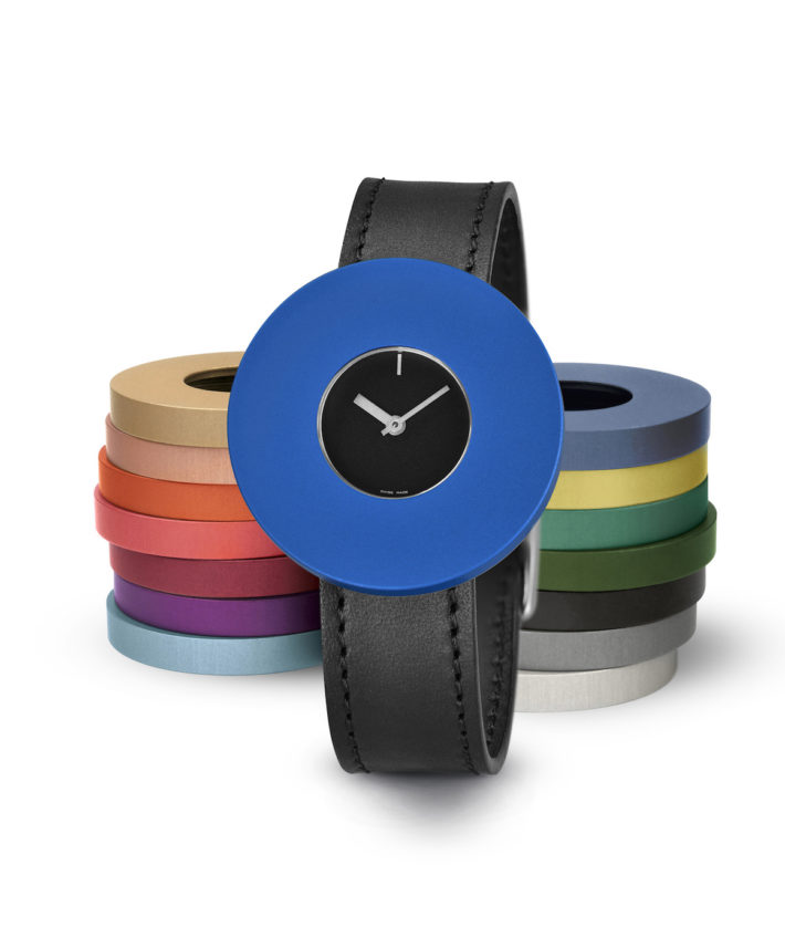
Halo watch, Junod, 1994. Design: Vignelli 1954-2014, © 2018 Rizzoli International Publications, New York, and Beatriz Cifuentes-Caballero.
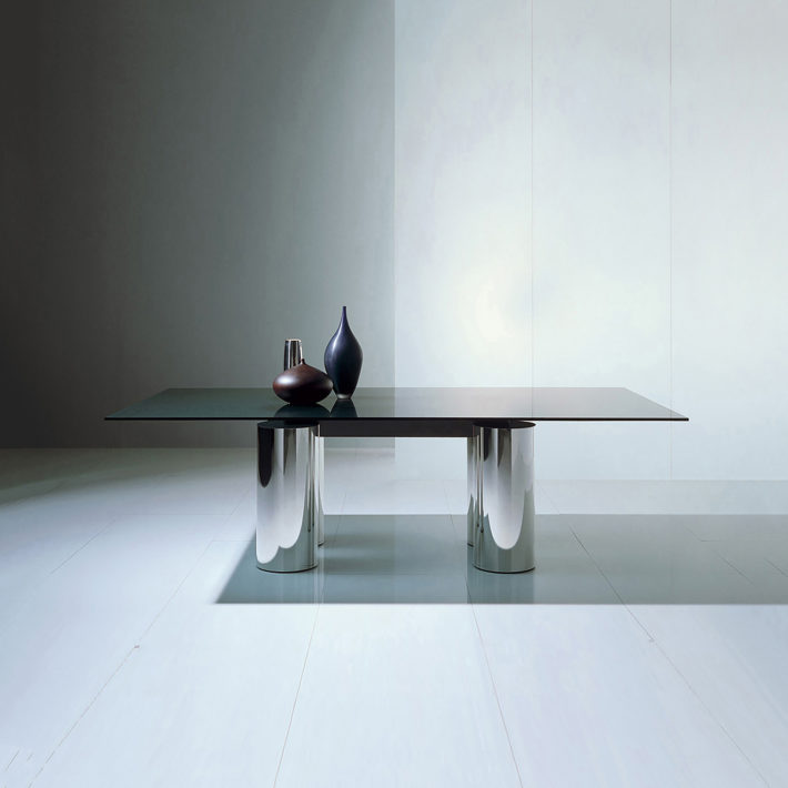
Serenissimo table, Acerbis, 1985. Design: Vignelli 1954-2014, © 2018 Mondadori Electa, Milan, and Beatriz Cifuentes-Caballero.
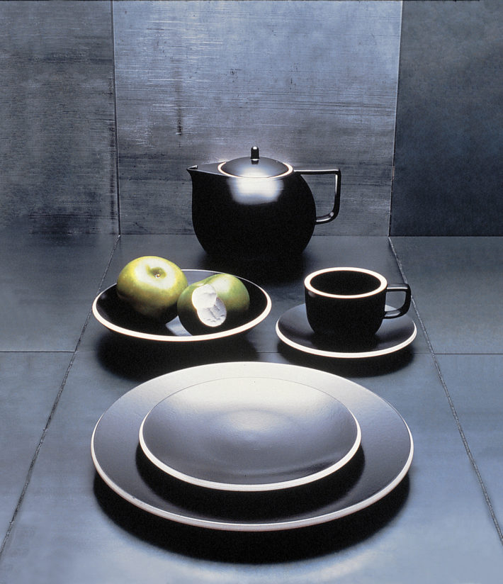
Colorstone dinnerware, Sasaki, 1985–87, Design: Vignelli 1954-2014, © 2018 Mondadori Electa, Milan, and Beatriz Cifuentes-Caballero. Photo: Luca Vignelli.

Menorah, San Lorenzo, 1995, Design: Vignelli 1954-2014, © 2018 Mondadori Electa, Milan, and Beatriz Cifuentes-Caballero. Photo: Luca Vignelli.
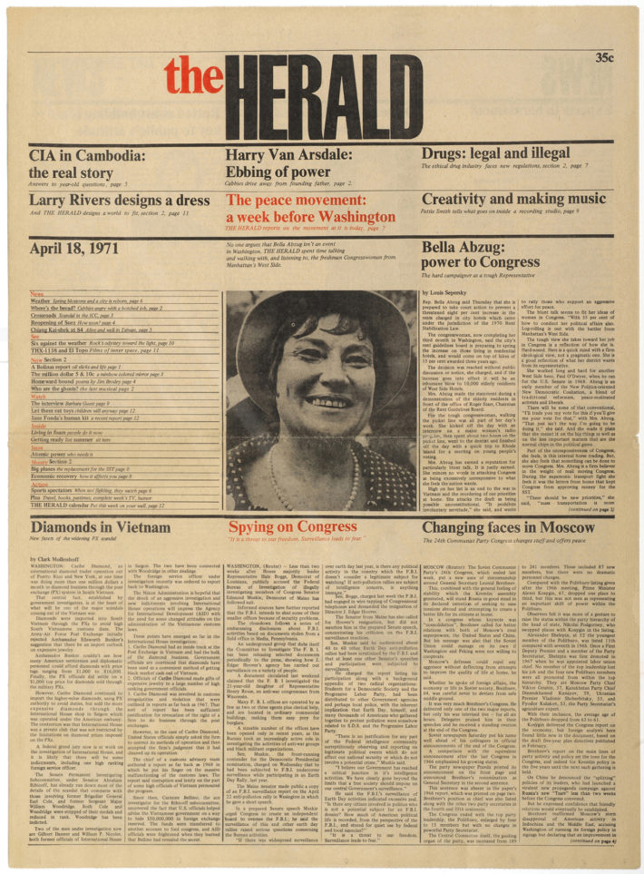
The Herald newspaper layout, New York, 1971. Design: Vignelli 1954-2014, © 2018 Rizzoli International Publications, New York, and Beatriz Cifuentes-Caballero.
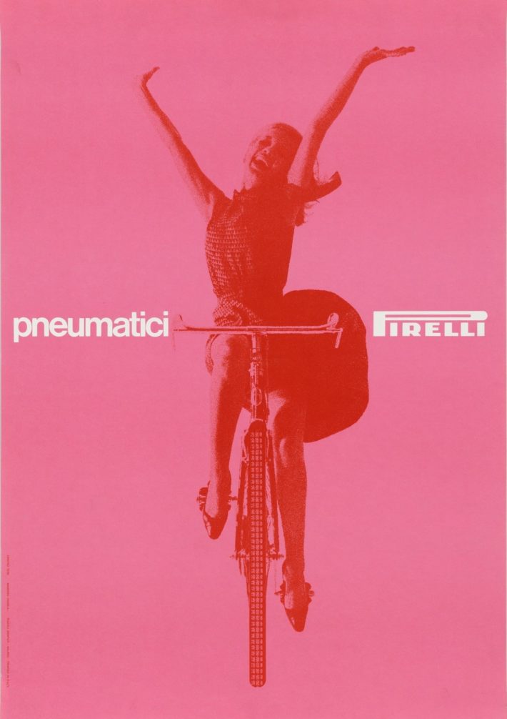
Massimo Vignelli, Pneumatici Pirelli, 1963. © The Museum of Modern Art / Licensed by SCALA / Art Resource, NY.

Richard Meier Architect, vol. 6, Rizzoli International Publications, New York, 2013. © Richard Meier & Partners Architects LLP, Los Angeles.
Notes
1 Pierre-Alain Croset and Luka Skansi, Gino Valle (Milan: Electa, 2010); English ed., Modern and Site Specific: The Architecture of Gino Valle 1923-2003 (London: Lund Humphries, 2018).
2 Serena Maffioletti, ed., La concretezza sperimentale: l’opera di Nani Valle (Padua: Il Poligrafo/Venice: IUAV, 2016).
3 Massimo Vignelli, “Lella Vignelli,” Domus, no. 980, May 2014, 34-36.
4 Carlo Vinti, Gli anni dello stile industriale 1948-1965. Immagine e politica culturale nella grande impresa italiana (Venice: Marsilio, 2007).
5 Steven Heller, “Vignelli’s Place in the Universe,” in Cifuentes-Caballero, ed., Design: Vignelli 1954-2014, 34-36.
6 Mario Piazza, “Lo stile milanese: Bob Noorda,” Progetto grafico, no. 8 (June 2007), 99; see id., ed., Bob Noorda Design (Milan: 24 Ore Cultura, 2015).
7 Jan Conradi, Unimark International: The Design of Business and the Business of Design (Baden: Lars Müller, 2010).
8 See the documentary film Helvetica made by Gary Hustwit in 2007.
9 “Working with Peter Eisenman has always been a great privilege for me. His immeasurable architectural curiosity and probing attitude has always been a great source of creative stimulation. Some of the best work I have done in graphic design was done for the Institute for Architecture and Urban Studies, IAUS, of which Peter Eisenman was the founding father and lively director. The work that I have donated to the Institute is perhaps the best investment of my life.” Massimo Vignelli in Cifuentes-Caballero, ed., Design: Vignelli 1954-2014, 192.
10 Ernesto Ramon Rispoli, Ponti sull’Atlantico. L’Institute for Architecture and Urban Studies e le relazioni Italia-America (1967-1985) (Macerata: Quodlibet, 2013).
11 Michael Hays, ed., Oppositions Reader. Selected Readings from a Journal for Ideas and Criticism in Architecture, 1973-1984 (New York: Princeton Architectural Press, 1998).
12 Richard Meier, Kenneth Frampton, Joseph Rykwert, et al., Richard Meier Architect, vol. 1 (white), 1984; vol. 2 (black), 1991; vol. 3 (red), 1998; vol. 4 (gray), 2004; vol. 5 (blue), 2009; vol. 6 (yellow), 2013; all published by Rizzoli International, New York.
13 Kenneth Frampton, “Omaggio a Vignelli,” in Cifuentes-Caballero, ed., Design: Vignelli 1954-2014, 38.
14 Massimo Vignelli, The Vignelli Canon (Baden: Lars Müller, 2010).
15 Germano Celant, “Lella and Massimo Vignelli,” in Cifuentes-Caballero, ed., Design: Vignelli 1954-2014, 18.