22 November 2018
Giorgia Lupi smiles, speaking in English and pronouncing each word clearly. Her voice is thin, she gesticulates slowly with her hands and her face, half-hidden behind a large pair of glasses, is expressive: her TED Talk (over 1.2 million views at the moment of writing) is entitled How we can find ourselves in data and, in spite of appearances, the title is neither hyperbolical nor metaphorical. For data are everywhere, and we are immersed in them. Giorgia Lupi is an information designer. Her job, if you will pardon the expression, is to give data a personality. She humanizes them, choosing how to classify, catalogue and display them, warming cold numbers at the hearth of the social sciences and creativity. Listening to her speak, an important idea comes to mind: that connecting such different fields of knowledge as art and statistics and getting them to hold a dialogue is the way in which culture progresses, given the fact that the world is not a jigsaw puzzle made up of independent categories and disciplines, separated by objective boundaries, but if anything an indivisible whole, an enormous amalgamation of experiences and information that are never wholly distinct from each other. At the beginning of her talk, given in March 2017 in New York, where she lives, Lupi tells a fascinating story about two similar occasions, but distant from one another in time, in which data have, as she puts it, failed us. When, people voted for Clinton and Trump in the 2016 presidential elections in the United States, almost no one thought that the latter was going to win. Not only did many analysts say that he was trailing in the polls: he was not even thought to have a chance. When, flying in the face of every prediction, he was actually elected, that surprise result triggered a feeling of déjà vu. Way back in 1994, in fact, when Giorgia was only thirteen and still living in Italy, very few people thought that Berlusconi, standing for election for the first time at the head of a new party, Forza Italia, could win. Instead, as we know, things went differently. Lupi uses this parallel between the two unexpected successes to illustrate the mistaken way in which we treat data as certainties when, after all, they are nothing but a means for getting at reality and representing it. Data, in short, are never the reality, but a spurious projection of it. They need to be put in context, interpreted and explained, and this is exactly what Giorgia Lupi does, working on her own or coordinating the projects of Accurat, the agency she founded in 2011 with Simone Quadri and Gabriele Rossi.
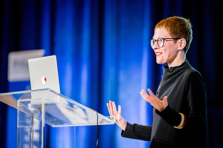
Giorgia Lupi giving her talk Designer’s Perspective: Data Visualization at the Wharton People Analytics Conference 2018.
Let’s start with something I’m curious about: what is your earliest memory of a drawing you made? And when did you realize for the first time the social importance of the communication of data?
My first memory of making a drawing is linked to an episode that earned me a resounding ticking-off from my mother: I had drawn a series of colored lines in chalk on the wall of her room. I was very little. In general, I like to tell people that ever since I was a child I have had two apparently contrasting passions, which I believe can explain the origin of my work and my desire to interact with data. On the one hand an obsession with numbers, cataloguing and classification, with systems and rules. I still recall the pleasure of spending the afternoons in my grandmother’s dressmaker’s workroom where, to her great delight, I catalogued all her buttons by color, size and the number of holes in the middle, and then drew labels to classify them. On the other hand, I’ve always loved drawing and, as I was saying, used to draw more or less everywhere!
In many cases data are still perceived as being cold and impersonal. How do you combat this perception? And, in this connection, what is this thing you call data humanism?
Often when we work with data we run the risk of focusing solely on numbers and quantities that are already available, on the datasets that are already there, and we don’t realize that these data can in fact become much more meaningful if we look at their more ephemeral and hidden aspects, if we are able to make connections and link the data to the context that has generated them. Very often, too, the data are described and imagined as the definitive response to our questions, as if they were infallible and perfect information on which to base our decisions. Data, any kind of data, are in most cases created by human beings. Data-driven does not mean “irrefutably true.” I think the time has come to give up this presumption of data’s absolute truth and to accept instead a conception and a representation of the fallibility of large numbers, of their imperfection, as it is only in this way that reality can be described in all its various aspects. This is why I am suggesting we change the way we see data. Data are a means that provides us with more information on the reality we are analyzing and experiencing, but they do not describe it perfectly, exactly, without flaws. Rather than the answer to our questions, data should be giving us cues to raise new, more profound and meaningful questions.
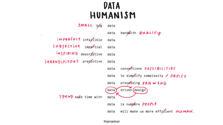
“Data Humanism—A Visual Manifesto,” by Giorgia Lupi, published for the first time in Print Magazine, January 2017.
But a new way of seeing data has to be accompanied by a new way of representing them.
Of course. A paradigm shift is also needed in the way in which we represent information visually. We are going to have to learn to include the more nuanced, qualitative aspects of data and render them usable. We will have to experiment and try to visualize the uncertainty, the possible errors and imperfections of the data. For too long we have separated the world of relationships, ideas and people from the world of numbers, of data, of science. I believe, instead, that looking at data with a human eye can result in a radical change from an analytical and interpretative point of view. Just as the humanist intellectuals of 14th-century Italy revolutionized the world of culture—I’m thinking primarily of Petrarch and Boccaccio—shifting attention back onto the human being, we ought to change our perspective on the world of data if we really want to start making them truly part of our lives: this is what I call data humanism. Given that our data are collected day after day, minute by minute, using technology unimaginable even just a few years ago, the challenge we face is to become hyper-human, in order to make the best use of them, with wisdom and ingenuity. I like to say that data can be a state of mind rather than a question of expertise and tools, and finally that data can help us to become more human and connect with ourselves at a deeper level, if look at them through the right lenses.
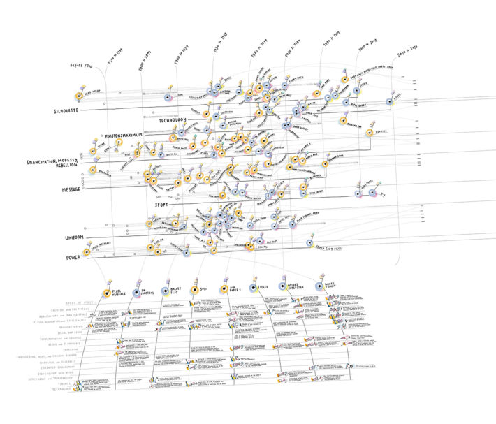
Data Items: A Fashion Landscape 2017, data visualization produced by Accurat for the exhibition Items: Is Fashion Modern?, Museum of Modern Art, New York, October 1, 2017-January 28, 2018.
With the project Friends in Space, in 2014, you made it possible for anyone who wished to do so to follow Samantha Cristoforetti on the International Space Station (ISS). Can you tell me where this idea, developed by Accurat, came from? In fact, it was a matter of getting social networks to reach out into space—for the first time, if I’m not mistaken.
Before leaving for her mission aboard the International Space Station, Samantha Cristoforetti saw some of the work done by Accurat and, through Twitter, we started to chat about what it would be fun to do with the data of her mission. Even prior to going into space, she always wanted to use her visibility for noble and important ends, and one of the themes about which she cared most was to use her mission to connect people with each other. So we decided almost at once to set aside any kind of scientific representation of the data and to concentrate on the more human aspect, and this led us to create Friends in Space, a web application based on the idea of giving people the chance to say hello to Samantha as she passed above their heads and, at the same time, to interact with all the people who were connected at the same moment in every part of the world. It worked in a very simple way: all you had to do was log on with your Twitter or Facebook profile and you immediately saw her position displayed on a map, along with that of all the other people connected at that time. So you saw where Samantha was at that precise instant and when there would be an opportunity to see her pass above you, and you had the possibility to send your own hello out into the ether, to her and to all your new friends and space enthusiasts. In its simplicity, the project allowed over twenty thousand people to make contact with one another, creating unexpected connections between enthusiasts and the curious in every corner of the planet. Obviously, Samantha responded regularly to the greetings, using Twitter from the space station to send her “Hello Earth,” which was transformed into a wave of greetings on Friends in Space. Visualizing data can reveal invisible aspects of ourselves and even establish a close and simple, nonverbal, connection with someone who might be on the other side of the globe, in New Zealand, or even in space.
How did you get started on your more recent collaboration with Kaki King? And what was it like to collaborate with her on the Bruises project, working with information on her daughter’s illness?
I began to work with Kaki, now a great friend of mine, on a brand identity project for Hennessy, coordinated by John Maeda: we created the visual identity for a special blend of their famous cognac through experimentation with a combination of music and data visualization. Bruises stems from a very personal and unpleasant situation, the fact that Kaki’s daughter, in 2017, at the age of two, had been diagnosed with an autoimmune disease of the blood, ITP (immune thrombocytopenic purpura): the body attacks the platelets and this leads to the formation of spontaneous bruises and burst blood vessels called petechiae, with bleeding from small wounds and a risk of brain hemorrhages. Right away I tried to work out how I could support Kaki and be close to her. How to keep track, day by day, of what was happening to Cooper, her little girl? Together, we developed a system for the daily observation and recording of a series of objective parameters, such as the number and color of the bruises, the clinical data of the various tests and so on. As well as more qualitative aspects: the emotions of Kaki and her family, the feelings that each of us has when dealing with our own illness or that of a loved one. On the one hand, the observation of these data has allowed Kaki to take back control, as far as possible, of an incredibly uncertain situation, and has given her the possibility to communicate with the doctors in a more thorough and effective manner, especially in stressful situations. At the same time, we tried to think of how to draw a more general indication from this story. The artistic project that ensued, called Bruises, has as its subtitle The Data We Don’t See, that is to say all the invisible data that can transform a difficult experience into images and music. The graphic representation shows the evolution of the disease in a gentle, almost poetic way, notwithstanding the crudity of the data: in fact, I wanted to create a visualization that would be able to touch people’s heartstrings and not just provide a level of understanding. And I tried to do it by working with the visual symptoms of this illness, turning them into symbols that could visually recall what was happening to Cooper’s skin. The collection of the data, which went on for 120 days, was then turned into a piece of music with 120 measures in which Kaki put what was happening into auditory form. It is hard for registrations of purely clinical data to reflect the impact that the sickness of a child has on its family. With Bruises we wanted to convey the information that was usually missing from a story of this kind. It was a very personal journey. We analyzed and communicated data that are normally ignored, almost as if we were looking for a way to heal; we transmitted empathy and emotions though the “data.”
On several occasions you have said you are constantly drawing. In what way can art help our understanding of the world in which we live? And how, in your case, does the relationship between drawing and the interpretation that you give of the world around you work?
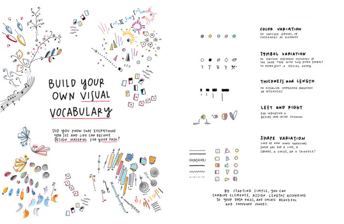
In general, a very large part of what I do depends on the way I learned to see the world, trying to find inspiration in less obvious places and to adapt visual suggestions and purely aesthetic intuitions to the projects on which I work. To do this, I try to understand each time what it is I like about what I see, what makes it harmonious, balanced and evocative, and then I try to re-create these characteristics in my works. I always say that in order to really learn to design you need to learn to see first. It’s undoubtedly one of the maxims that best represents what I am. I’ve realized that I’m most inspired by visual languages that are in a way already conventional, whose aesthetics are familiar to our minds: if a set of aesthetic norms—governing forms, colors and spatial composition—function in a context that I am observing, I try to apply them to the design on which I’m working. The visual contexts I’m referring too are abstract art, as well as the repetitive aesthetics of musical notes, especially in contemporary music, or the system of layering in architectural drawings or even the shapes of objects and forms in nature: visual settings to which our minds can make reference without necessarily taking them in fully. And then, as you were saying, drawing. Drawing to regain possession of the forms which I’m attracted to, drawing to mull over an idea and see if it works.

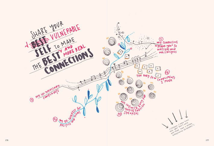
Cover of Giorgia Lupi and Stefanie Posavec’s book Observe, Collect, Draw!, © 2018 Princeton Architectural Press.
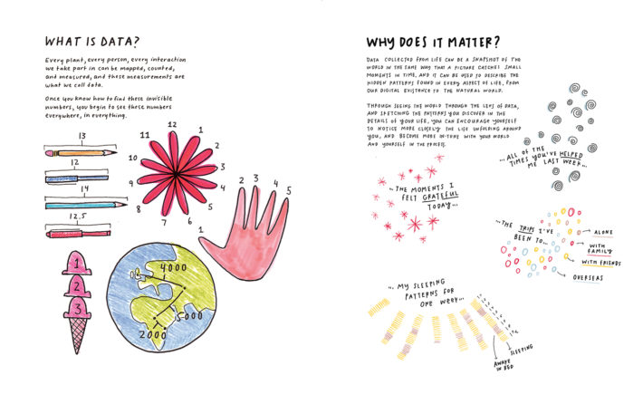
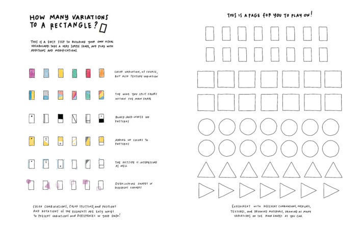
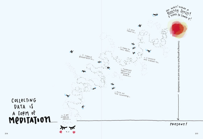
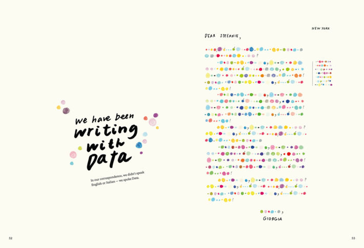
On the subject of drawings, Princeton Architectural Press recently brought out your Observe, Collect, Draw!, a guide that teaches us how to document our daily habits by means of visual schemes. The book, we should point out, is an offshoot of Dear Data, a project that you carried out between 2014 and 2015 with Stefanie Posavec: for a year, you sent each other over 100 postcards that illustrated your lives with drawings made by hand. Out of that experience came a first book, and now we have reached the second. How did this come about?
The idea of Observe, Collect, Draw! sprang from the success of Dear Data. After that project, we discovered that hundreds of people had taken up our creative format for the collection of personal data, utilizing it to examine their lives. Many teachers have used it as an educational aid. So we decided to create a practical tool that would offer everyone the opportunity to analyze and document their own experiences in an original manner. The book contains a lot of tips on how to learn the language of data visualization, and many pages that give you the possibility of re-creating exactly what Stefanie and I did for a year, but with totally new themes and visual codes. I’m very happy with it, it’s going well and is used and appreciated even by the very young. While the first volume, Dear Data, comprised our 52 postcards, along with some new illustrations, Observe goes a step further. It’s a manual with real instructions. It proposes a method and tells you what to do.
From Giorgia Lupi and Stefanie Posavec’s book Observe, Collect, Draw!, © 2018 Princeton Architectural Press
From Giorgia Lupi and Stefanie Posavec’s book Observe, Collect, Draw!, © 2018 Princeton Architectural Press
From Giorgia Lupi and Stefanie Posavec’s book Observe, Collect, Draw!, © 2018 Princeton Architectural Press
From Giorgia Lupi and Stefanie Posavec’s book Dear Data, © 2016 Princeton Architectural Press.
From Giorgia Lupi and Stefanie Posavec’s book Dear Data, © 2016 Princeton Architectural Press.
From Giorgia Lupi and Stefanie Posavec’s book Dear Data, © 2016 Princeton Architectural Press.
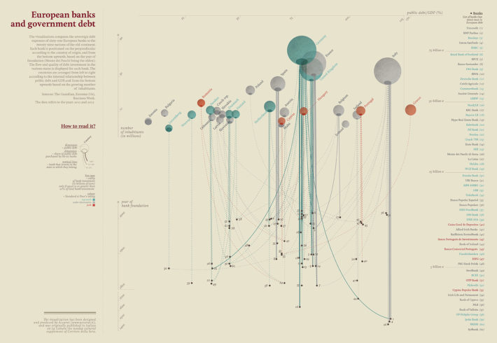
“Banche europee e debito sovrano” (“European Banks and Sovereign Debt”), data visualization produced by Accurat for La Lettura, Sunday supplement of Il Corriere della Sera, April 21, 2013.
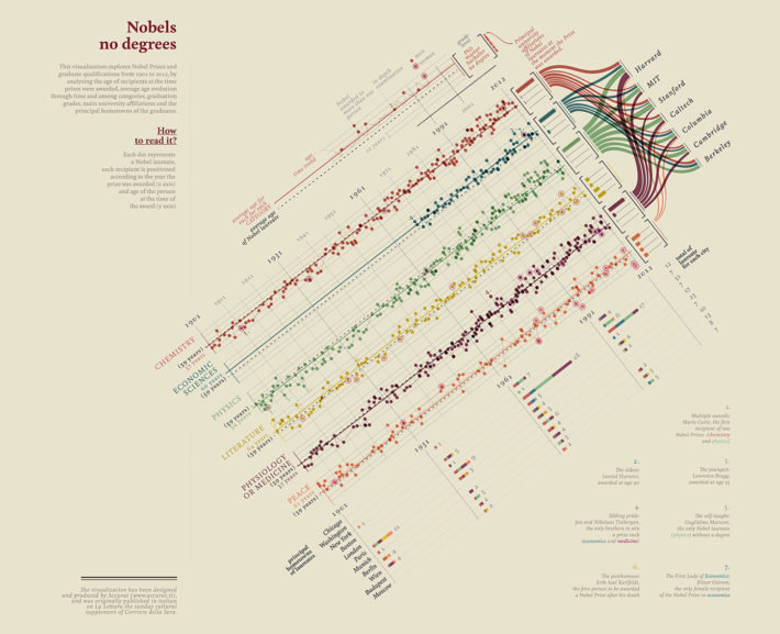
“Quanti (non) laureati al Nobel” (“How Many (non) Nobel Prizewinners”), data visualization produced by Accurat for La Lettura, Sunday supplement of Il Corriere della Sera, November 25, 2012.
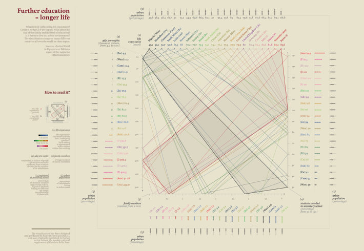
“Studia di più, vivrai a lungo” (“Study More, You’ll Live Longer”), data visualization produced by Accurat for La Lettura, Sunday supplement of Il Corriere della Sera, July 29, 2012.