24 May 2013
In response to great demand, we have decided to publish on our site the long and extraordinary interviews that appeared in the print magazine from 2009 to 2011. Forty gripping conversations with the protagonists of contemporary art, design and architecture. Once a week, an appointment not to be missed. A real treat. Today it’s Joost Grootens’s turn.
Klat #05, spring 2011.
Joost Grootens swears he uses no art at all, but in the meantime, during what he defines the era of information obesity, he reinvents books, privileging the text’s material and tactile aspects, graphic clarity, and rigorous and creative composition. Grootens studied architecture at the Rietveld Academy in the nineties but soon discovered that he was more interested in the representation of architecture than the actual design of buildings. His new monograph I swear I use no art at all functions as an atlas of his own work over the last ten years, comprising the design of more than one hundred books. It testifies to his belief in the neutrality or absence of the designer in the creation of what he considers tools or half-products, finished by the reader. Having produced seven atlases, including his recent Atlas of the Conflict. Israel-Palestine with Malkit Shoshan, Grootens is perhaps best known for reinventing the typology of the atlas, with superbly clear graphic designs capable of rethinking the book’s function in the digital era. In 2009 Grootens was awarded the Rotterdam Design Prize for four of the atlases he has produced for 010 Publishers: Metropolitan World Atlas, Limes Atlas, Vinex Atlas and The Big KAN Atlas.
Is it true, that you use no art at all?
I try not to, although I realize it’s no easy thing to do… I make an effort and try to be neutral in my works. That’s all.
In this age, when it seems everyone is eager to claim authorship, designers are being promoted as artist-geniuses, limited editions are commanding the price of artworks, architecture and art are colluding as authored originals, why your desire to disappear?
The books I try to make are specialist tools of information. What I do, or what I make, are tools. For this particular product, for these tools, neutrality style is essential. The other reason I pursue an absence of design in my books is that I strongly believe that today there is simply too much information. It is an age of information obesity, when it is so simple to produce information. In this context design and designer should have clearly distinct roles. I see myself as an intermediary between the reader and the author, but also between the publisher and the printer. And my role as intermediary is to facilitate the communication process. Keep in mind that I often work on specialist books that have small print runs and are aimed for a clearly defined readership of specialists. They use these books as tools, as references, as templates, or as starting points for their own work.

Atlas of the Conflict. Israel-Palestine by Malkit Shoshan (author, maps, data). Design book and maps by Studio Joost Grootens. 010 Publishers, 2010.
How do you define tool?
A tool is a thing that is not finished in itself, but needs to be finished by a reader. I see the things that I do as half products, unfinished things. It is up to the reader to discover the information, especially in the atlases, where they can compare maps and data, photographs, different moments in time. Sometimes the information in these books is so complex and so layered that it is up to the reader to work with this content. This kind of books can’t have too many design concepts – no more than four, I’d say. My contribution must be minimal, as it were. Unlike traditional fiction, the books that I make are seldom made to be read in a linear way. One can start at the table of contents, or start at the index, or start with a series of maps in the middle. So it is more like a web-surfing experience than watching a movie.
Would you compare the experience that you create for the reader to an urban experience? It seems the structures you design allow one to wander or drift, reroute, discover and continually make choices about the direction one is taking, almost like walking through a city.
Well I always think of books as spatial experiences, a travelling back and forth.
Why atlases, why maps?
I don’t like maps particularly, I like maps in a book. In a book that contains many maps, you have a comparison between one and the other. As soon as they are put in relation, there is a graphic play between different pages. Of the over one hundred books I have made so far, only seven are real atlases with maps. To me, the atlas represents something special. It shows the necessity to present information in as convenient a way as possible and uses a whole range of graphic devices to achieve this: color, pictograms, typography, cartography, infography and scale. It also offers through (visual) indexing systems more ways of accessing the same information. In the other books I make use of elements of the atlas, visual indexes, the juxtaposition of simultaneous flows of information, the graphic translation of data. But in the atlases these elements are used in their most extreme way.
Limes Atlas by Jos Bazelmans, Ton Bloemers, Robert Broesi (MUST Stedebouw), Bernard Colenbrander, Catherine Visser (DaF architecten). Design book and maps by Studio Joost Grootens. 010 Publishers, 2005.
I know that all this derives from an epiphany, when while studying at the Rietveld Academy you discovered you were more interested in the representation of architecture than in actually designing buildings.
Yes. In the representation architects show much more than in the physical buildings. They show their ambitions, who they see as their peers, how they see themselves in the historic perspective of the profession.
Insofar as your books can be read or considered as spatial constructions would you go so far as to say that they are also a form of architecture? Or literally, paper architecture?
Not paper architecture. This to me is architecture that never materialized, plans that remained plans. Whereas the books I make are physical, spatial objects making use of tactile materials for the cover, using the transparency of paper and specific inks. There is the physical act of leafing through a book. Those are all very spatial experiences. But there is also another spatiality: by placing a map next to data, somehow these two start to interact. The book is an interesting object, it is both simple and complex.
With the introduction of iPad and Kindle, it is commonly thought that digital media is replacing printed media, that the book will become obsolete. But in your essay I swear I use no art at all you argue that the Web opens up many more possibilities for the book, that the book is the better option. Would you elaborate this concept?
First, I wouldn’t mind if there were fewer books produced. There are a lot of things the book used to have to do that it doesn’t have to do anymore. In the nineties, for example, many architectural monographs seemed to be mere office brochures, a function which has essentially been replaced by the website. Since the Web relieved the monograph from a certain kind of duty, it also leaves room for new kinds of architecture books to emerge. One type explores the representation of architecture, such as the books of Atelier Bow-Wow, where they question what we are looking at. Is it presentation? Is it a technical drawing? Or consider a book like Herzog & de Meuron’s Natural History. It explores the whole process of architecture, but hardly shows any buildings. I am the first to admit that a book has limitations in comparison to digital media. It is expensive, environmentally unfriendly, lacks in interactivity in the sense that information cannot be updated easily. But it does have certain advantages. The quality of the images, the concentration of information and its materiality are all characteristics of the book that gives it an advantage over a computer screen. As a designer, I try to exploit these aspects to the full. Another aspect I like about the book is it finiteness versus the infiniteness of the internet. A book is something one can hold, literally grasp. The reader doesn’t have to perplexedly ask himself what he’s looking at in front of every page.
What does that mean exactly?
I mean that we have to get rid of the myth of visual complexity, and head straight to content, with no frills. I don’t mind monotonous sequences of pages. I am not a page pleaser. They can be boring if that is the consequence of the content in the system I devise.
I swear I use no art at all, concept and texts by Joost Grootens. 010 Publishers, 2010.
You say: “Superimposing graphic information onto something else is based on the misconception that visual complexity can visualize a plurality of meaning.” Does visual clarity best convey conceptual complexity?
Clarity has a kind of beauty. It is so clear that you cannot deny what it is. I do not have to spell it out. I am from the school of “show not tell.”
You have recently been appointed the Programme Leader Information Design at the Design Academy Eindhoven’s Master Course. How does this design philosophy play into your teaching and how are you shaping the department?
At Eindhoven I am working on three things: doing the kind of things that I do in my book designs, the translation of information, and creating interfaces that can be done in analogue products like books, but also in digital products like an iPad application. Then there is another aspect we are exploring, that leans toward letting designers design their own tools. In this sense we are dealing with software. The computer made the whole design process more democratic, less specialized. If you like, typesetting used to be a very obscure world, there were only certain skilled people with specialist knowledge and tools who could typeset. But now everyone can do it with the click of a button. The next logical step would be our independence as designers from companies like Adobe and Microsoft, and our freedom to design our own work tools. In the third part of the course we reflect on the information age and on the role that design plays in it.
As a designer you uphold the need of a neutral position, but one could object that this position of yours could in the end transform itself into a sort of signature, of style…
There are certain specifics that I use again and again: materials, the use of white on the page, the translation of data into graphics. But there are other things that vary continually. All the books are different sizes. For example, Atlas of the Conflict is scaled to the hand. Typefaces also vary. Other designers are more consistent in that sense. Maybe I am more limited in the paper and the inks that I use, but I explore other things. I agree though, there are certain similarities between the things that I do.
You reinvented the atlas and the index by working on the book’s tactile and material side. What is the allure of metallic and fluorescent inks?
Fluorescent inks have a certain materiality, a different presence on the page. They are matt, and seem to lie on the page and not sink into the paper like other kinds of ink. Holding a book with these different inks and slightly tilting it, one can almost turn these inks off. Sometimes they are very present and sometimes they seem to dissolve into the background. The book becomes interactive, but in a very lo-fi way.
Vinex Atlas by Jelte Boeijenga & Jeroen Mensink. Design book and maps by Studio Joost Grootens. 010 Publishers, 2008.
In your projects essentiality, exactness and clarity are surplus values. What relation do your books share with the age of excess we live in?
The books I design are clearly products of the information age, they could not have been made without the computer, database software, the Internet, etc. The readers of these books are also part of this digital, information age. They are used to things like thumbnail images, the interface of iTunes, but also to working and looking at a computer screen, while at the same time a TV is on in the same room showing live news, while they are twittering or sending text messages on their smartphone. In other words they are used to some kind of information excess. I try to incorporate these experiences of the reader in my designs. My visual indexes should have the ease of the organization of iTunes, but should at the same time show the completeness of iTunes. So not only the song title, but the name of the album, the name of the artist, the year in which the song was released, my personal rating of the song, information about when I added it to my library, and how many times I have listened to it.
Working by subtracting. On your works many things remain unseen…
Well, there is a lot to say about the things you don’t see in my book designs. Often the things you don’t see are the most difficult, the ones on which I work the hardest. That a book doesn’t include photographs, for example. The Limes Atlas deals with the northern border of the Roman Empire in the Netherlands, and I had to deal with people who wanted to include actual photographs of Romans… Not to include certain things, that is a big part of my work.
Often photographs are the most obvious, default form of representation. Do you tend to resist using them?
If I think it is not really essential. Though not in principle, I am not against photographs. Twenty years ago photographs were much more expensive to include in a book design. So one had to think about every decision that was made in a much more conscious way. To include photographs now is so easy that it’s hard not to use them.
How does this decision-making process enter into the art books you do? Like the ones that rely heavily on artistic photographs such as Mark Pimlott’s Without and Within or Findings on Ice or Findings on Elasticity, for example? Do you work in collaboration with the artist or the architect?
If you go to Without and Within the book deals with the notion of a link, a continuation between certain historic landscapes (how these are photographed) and large public spaces like airports or museums. The book has both images on the early North American landscape and more contemporary images of large public spaces. There is a similarity between them. In itself the book is a very standard, classical textbook, but there are a few minor, albeit essential decisions in relation to the images. All the landscape images are printed in duotone, in black and dark gray, so they become intense and heavy and there is a high contrast between white and black. For the interior photographs of the public spaces, I used black and a metallic varnish, very subtle. So I try to emphasize or try to translate the points the author is trying to make, to materialize them almost. I can talk about typography in this regard as well. It is a very classic textbook in layout, but in the choice of typefaces by Canadian and American type designers and the way the text is treated, there are references to the American landscape and the city as well.
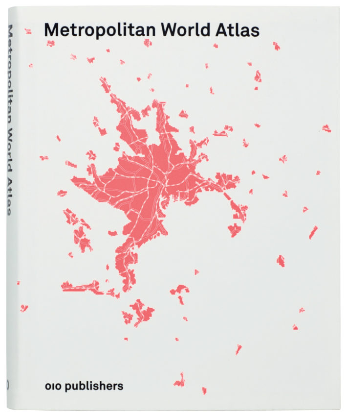
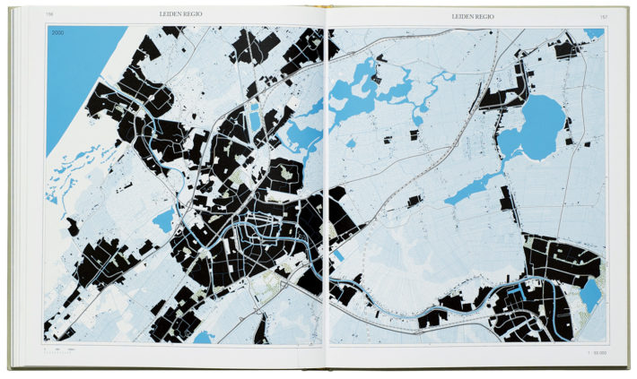
Metropolitan World Atlas by Arjen van Susteren. Design book and maps by Studio Joost Grootens. 010 Publishers, 2005.
The idea of heightening the content or conceptual viewpoint of the photograph through printing is extremely interesting. If Mark were to reproduce some of these photographs within the space of the gallery, would he use these techniques? Or is this a technique only possible within the space of the book?
The technique is for the book. But I guess Mark would have to make similar decisions if he were to represent his work in the space of a gallery. I am constantly aware that my work consists in translating an idea and transforming it into paper and ink. Some of the other books like the Findings on Ice and Findings on Elasticity are very much about this. The whole point of the Findings on series – I have done two now – is that both art and science are creative acts, so they stress the creativity of the sciences and the artists, filmmakers, poets. In the books I try to create encounters between these worlds, but not present a science project as an art project, or the other way around. I try to give a science project the graphic context of a science book, or the art work that of an art book. I play with the conventions or clichés of these kind of books. My goal is to let all the content sit in its natural context. The context is something I think a lot about when beginning a book, what is the right kind of context. For Without and Within I wanted to make a sort of North American academic publication, but more tactile and material, more of an object. I am very inspired in that sense by certain architects who are working in a modernist tradition, but who are at the same time very aware of the local conditions and incorporate these in their designs.
When you talk about using or creating specific contexts, do you mean that you use a specific book typology?
Yes, I very much use typologies. For me it is also a certain relief because if I find a certain typology, then half of the design is there. Because all of the design decisions come from the typologies–size, typeface, kinds of paper. Then the most interesting step is to see if the typology needs some adjusting to fit the content. Sometimes I juxtapose two typologies within one book. In the Atlas of the Conflict, for example, there is the atlas and the lexicon. Or in Findings on Elasticity there is the scientific journal and the art book.
Earlier you mentioned being inspired by architects working within a modernist tradition, but whose work seems to be rooted in the context of the buildings. Who might these include?
I tend to like British architects like Tony Fretton, Sergison Bates, Adam Caruso and Peter St. John. They don’t bring their fixed set of forms, materials and sizes. They observe a context and then make something that is both independent of the surroundings yet clearly reflecting some of its features. But there are others. Sigurd Lewerentz, for example, a Swedish architect who made some wonderful churches in the fifties and sixties. And there are many Swiss architects whose work I admire. So no Dutch architects.
Atlas of the New Dutch Water Defence Line, edited by Bernard Colenbrander and Rita Brons. Design book and maps by Studio Joost Grootens. 010 Publishers, 2009.
There has been such a celebration of Dutch design over the last two decades, with things such as Droog Design or publications such as Super Dutch. Do you consider yourself a Dutch designer?
Yes and no. On the one hand the things that I do fit this country’s culture and heritage, but the things that I do, do not look Dutch. I am very present in the editorial process, and this is a typically Dutch thing. Any stylistic aspects of Dutch design though are difficult to find in my work.
What do you consider the typology of the art book?
Is it the exhibition catalogue, with a long, introductory essay, followed by a series of plates and project texts?
Lately I have been working on the design of a book about a museum collection. The collection is the economic backbone of the museum. The history is there, it forms a kind of a map of all the decisions that have been taken, all the politics of the museum. How does one make a book out of this? It is like a database that you can look at in various ways. I recently did a project for the Van Abbemuseum. With infographics along the walls and in a few museum rooms we gave a visual representation of the disparity between male and female artists in the collection. We realized, for example, that until the eighties very few works by female artists were collected. If you know how to look at such a collection, you can read so much information there.
Could a book on a collection be an atlas of a collection?
Of course. The book I have in mind is a kind of graphic representation of an enormous database of works that happen to be artworks. But it is a data set. The atlases that I make contain maps, but this is only one way to look at data. So that is what I would like to do, make an atlas that doesn’t contain any maps.